Student guide: Charts
The Charts tab draws the readings selected in the Filters. The menu on the left (Charting) chooses the chart and its settings; the chart is on the right, with a summary and How this is calculated under it.
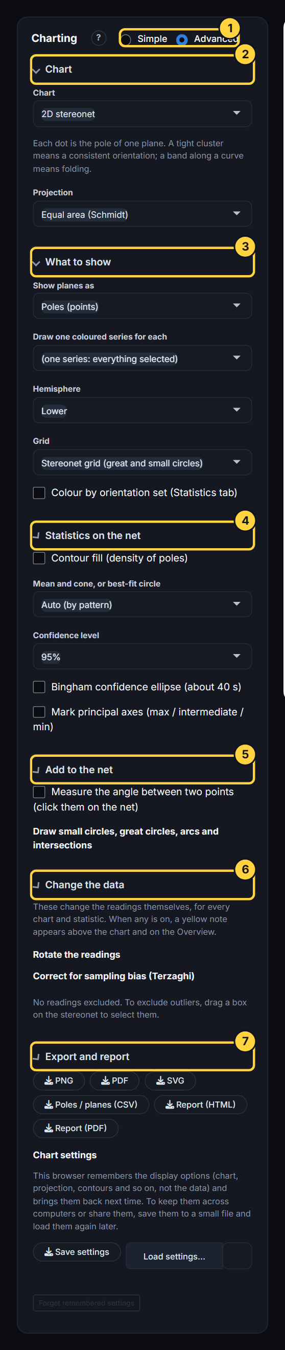
Simple and Advanced
At the top of the menu, Simple shows the common options and Advanced shows everything: the hemisphere and grid, contour methods and levels, principal axes, the Bingham ellipse, small circles, Change the data, and saved settings. Advanced is on by default.
A setting hidden in Simple keeps the value it last had. If a chart looks different from a classmate’s, switch to Advanced and compare every setting.
Which chart?
Choose under Chart.
| Chart | Shows | Use it for |
|---|---|---|
| 2D stereonet | Every reading as a point on a circle (the lower hemisphere, projected flat). | The standard picture of orientation data: patterns, means, fold axes, contours. |
| Rose diagram | How many readings point in each direction, as wedges. | Strike or trend directions on their own, for example joint strikes on a map. |
| Depth strip log | Readings down each drillhole, with the lithology. | Seeing where structures are in a hole, and how they change with depth. |
| Fracture frequency / RQD | Fractures per metre (or RQD) down one hole. | Rock-mass quality and fracture intensity. |
| Attribute chart | A histogram, bar or pie chart of any column. | Checking a column’s values: depths, types, widths, apertures. |
| 3D hemisphere | The same poles on a 3D bowl you can turn. | Understanding what the stereonet projection is doing. |
| 3D drillhole traces | The holes in 3D from their collar and survey, with the structures on them. | Checking hole paths and where structures sit in space. |
The 2D stereonet
What it is
Imagine a sphere centred on the structure. A plane through the centre cuts the lower half of the sphere in a curve (its great circle); the line at right angles to the plane meets the lower half at one point (its pole). The stereonet draws that lower half flat, as if looking down on it. North is at the top.
- A pole near the centre is a gently dipping plane; a pole near the edge is a steep plane.
- A pole sits on the opposite side of the net from the way the plane dips. A plane dipping to the east has its pole on the west side.
- For lines, the point is the line itself: near the centre is steep, near the edge is shallow, and it sits on the side the line plunges towards.
Projection
Under Chart, Projection chooses how the hemisphere is flattened.
| Projection | Keeps true | Use it for |
|---|---|---|
| Equal area (Schmidt) | Area: equal patches of the sphere stay equal on paper. | Contouring and statistics (the default). Densities are only meaningful on an equal-area net. |
| Equal angle (Wulff) | Angles: circles on the sphere stay circles. | Geometric constructions and measuring angles by hand. |
Example: load the girdle demo and switch between the two. The points move, especially towards the edge, but their pattern is the same. Turn on contours and compare: on the equal-angle net the densities near the edge are distorted.
What to show
Show planes as (planes only):
- Poles (points): one point per plane. Best for many readings, and the only way to see density.
- Great circles (up to 300): the plane itself as a curve. Easier to picture for a few planes. With more than 300 planes, 300 evenly spaced ones are drawn so the chart stays readable.
- Poles and great circles: both.
For lines, Show lines turns the points on and off. For lines on planes (rake data), Show the planes the lines lie on draws each line’s own plane, so you can see slickenlines on their fault planes.
Draw one coloured series for each splits the readings into colours: by Structure type, by Domain, or by Any column you choose. Up to the eight largest groups get a colour; the rest are grey “Other”. For a numeric column with many values the app makes five classes of equal size (for example depth 0 to 40, 40 to 85 …). Each group with 3 or more readings gets its own mean cross, and a table under the chart gives each group’s mean, kappa, K and pattern.
Why: colouring by structure type shows at once whether two types share an orientation. Colouring by depth or domain shows whether orientation changes across the area.
In Advanced:
- Hemisphere: Lower (the geological convention) or Upper (viewed from above). Only the 2D stereonet and its downloads use the upper hemisphere.
- Grid: a Stereonet grid of great and small circles every 10°, a Polar grid of rings and radial lines, or None.
- Colour by orientation set (Statistics tab): colours each reading by the set the set finder put it in. It is ticked for you when sets are found.
- Write the labels beside the points: writes the value of the Label points with column beside each point (up to 300 points).
Statistics on the net
Contour fill (density of poles) shades the net by how crowded the poles are: darker means more poles per unit area.
Why: with hundreds of readings, points overlap and you cannot see where most of them are. Contours show the true concentration, and they are what most published stereonets show.
In Advanced, Contour method chooses how density is measured:
| Method | Measures | Read it as |
|---|---|---|
| Kamb (sigma above uniform) | Counts the poles inside a small circle around each point. The circle’s size is chosen from the number of readings, so that a uniform scatter would give 3 standard deviations of the expected count. | Standard deviations (σ) above a random scatter. 2σ and more is conventionally significant. The default. |
| Schmidt (percent per 1% of net area) | Counts the poles inside a circle covering 1 % of the net. | Percent of all readings per 1 % of area. Uniform = 1. The classic hand-contouring method. |
| Fisher (multiples of uniform density) | Smooths every pole with a bell-shaped kernel. | Multiples of a uniform density. Smoother than counting. |
For Kamb, Contour interval (σ) (default 2) and Lowest filled contour (σ) (default 2) set the levels: with both at 2, the shading starts at 2σ and steps every 2σ. For the other methods the levels start at twice a uniform density and step in round numbers.
Example: if the highest Kamb contour on the cluster demo is, say, 12σ, the concentration there is twelve standard deviations above what random orientations would give: a real preferred orientation, not chance. A patch that only reaches 2σ is at the edge of significance.
Mean and cone, or best-fit circle chooses what is drawn over the points:
| Choice | Draws | Fits |
|---|---|---|
| Auto (by pattern) | Whichever suits the pattern the app finds. | Most of the time. |
| Cluster: mean + Fisher cone | A red cross at the mean, and a dashed circle (the cone of confidence). | Readings bunched around one direction. |
| Girdle: best-fit circle + fold axis | A green great circle through the poles, and a red diamond at its pole (the fold axis). | Poles spread along a great circle: folded layers. |
| None | Nothing. | Showing the raw data. |
Why the choice matters: a mean and cone describe a single cluster. On a girdle the mean falls between the two fold limbs, where there may be no readings at all, so it is meaningless. A best-fit girdle and its pole (the fold axis) describe a girdle. Auto picks using Woodcock’s K (see the Statistics guide).
Confidence level (Advanced) is 95 %, 99 % or 99.9 %. It sets the size of every cone of confidence and ellipse in the app, here and on the Statistics tab.
Bingham confidence ellipse (Advanced) fits a Bingham distribution and draws its confidence ellipse around the mean, or around the fold axis for a girdle. Unlike the Fisher cone, the ellipse can be elongated, so it suits clusters that are stretched in one direction. It takes about 40 seconds.
Mark principal axes (Advanced) marks the three eigenvectors of the orientation matrix: the maximum (red square), intermediate (orange triangle) and minimum (purple circle). For a cluster the maximum is the mean; for a girdle the minimum is the fold axis.
Add to the net (Advanced)
Measure the angle between two points: tick it, then click two points on the net. The app gives the angle between the two lines (or the two poles, for planes) and draws the arc. For planes, the angle between the poles is the angle between the planes.
Draw small circles, great circles, arcs and intersections draws a construction from values you type:
| Draw | You type | Use it for |
|---|---|---|
| Small circle about an axis | axis trend and plunge, and the cone half-angle | A cone around a line, for example the drillhole’s blind zone or a friction cone. |
| Great circle of a plane | dip and dip direction | A reference plane, such as a bench face. |
| Great circle through two lines | two lines | The plane containing two lineations. |
| Arc between two lines | two lines | Showing the angle between them. |
| Intersection of two planes | two planes | The line where two planes meet, for example a wedge axis. Its plunge and trend are given. |
Constructions appear on the stereonet, the 3D hemisphere and the downloads.
Change the data (Advanced)
These change the readings themselves, for every chart and statistic. Whenever one is on, a yellow note says so above every chart and on the Overview, with Undo all. Nothing changes your file, and the Data tab keeps the original values.
Rotate the readings turns every reading about an axis by an angle (positive is clockwise looking along the way the axis plunges). Set the axis and angle yourself, or use a preset:
- Flatten the mean bedding: turns the mean pole to vertical, so the mean bedding becomes horizontal. Use it to see structures as they were before the beds were tilted.
- Make the fold axis horizontal: removes the plunge of a fold.
- Turn about a vertical axis: changes north, for example to a mine grid.
Unfold a fold (planes) turns every plane about the fold axis, each by its own angle, until the limbs lie flat. The axis can be fitted to the readings (the pole to the girdle) or typed in. A cylindrical fold collapses to one point; what stays scattered is how far the fold departs from a cylinder. The app warns you if the readings do not form a girdle, because then the fitted axis is probably not a fold axis.
Correct for sampling bias (Terzaghi) gives each plane a weight for how likely the drillhole or scanline was to cross it. A hole meets planes at right angles to it far more often than planes running along it, so in a vertical hole steep joints are under-counted. The weight is 1 / |cos δ|, where δ is the angle between the plane’s pole and the hole, capped at Largest weight allowed (default 10) so that planes nearly parallel to the hole do not dominate. Choose Each reading’s own hole for oriented core, or One hole or scanline I type in.
Why use it: without the correction, the statistics describe what the hole saw, not what is in the rock. With it, they estimate what is in the rock. The note under the chart gives the effective sample size: the number of equally weighted readings the weighted data are worth. Report it.
Excluding readings: drag a box (or a lasso) on the stereonet to select readings, then Exclude these with a reason, or Use only these. Excluded readings are left out everywhere and marked in the Data tab CSV with your reason. Restore excluded and Back to all undo them.
Reading the chart
Under the chart, the summary gives the number of readings, the mean plane or line, kappa, the cone, Woodcock’s K and C and the pattern, then a plain-language Reading this chart:
- Girdle: “The readings spread along a great circle… typical of folded layers”, with the fold axis.
- Cluster: “The readings form a single cluster”, with the mean, kappa and the cone, and a caution if kappa is below 10.
- Weak: “No clear preferred orientation… Check that structure types and domains are not mixed.”
How this is calculated opens a window with the formulas and the values for your data: the projection, the conversions, any changes you switched on, the statistics, the contour method with your counting-circle size, and the tools.
The rose diagram
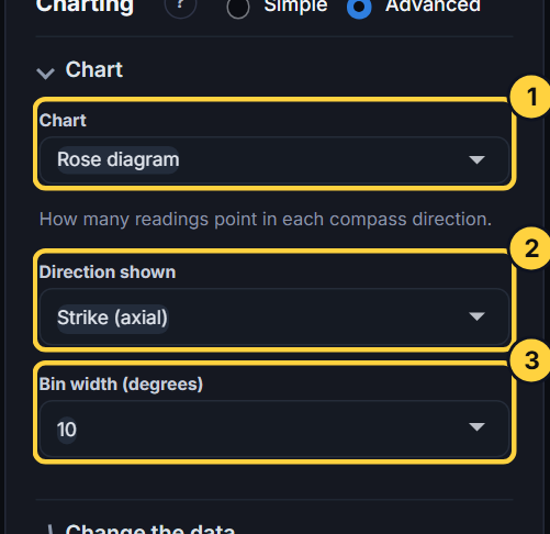
A rose diagram counts readings in direction bins and draws each bin as a wedge, longest where most readings point.
- Direction shown (planes): Strike (axial) or Dip direction. Lines always use their trend.
- Bin width (degrees): 5, 10, 15, 20 or 30 (default 10). Narrow bins show detail but are noisy with few readings; wide bins are smoother.
A strike has no single direction: a strike of 030 is the same line as 210. So strikes are drawn both ways (axial), and their mean is found with doubled angles. The strike shown is always the right-hand-rule strike worked out from the dip direction.
The footer gives the mean direction, the mean resultant length R (0 = no preferred direction, 1 = all the same) and the confidence range of the mean, drawn as the shaded wedge. If the directions are too spread the range is “none (too spread)”.
Why: a rose shows direction only and loses the dip, so use it alongside a stereonet, not instead of one. It is the natural chart for strikes on a map or trends of lineations.
The depth strip log
The strip log draws up to six holes side by side on one depth scale. You need a Depth column and, for more than one hole, a Hole / site column; choose the holes under Holes.
For each hole there is a header (collar, depth, dip and azimuth, readings) and tracks:
- Lithology (when a geology or lithology table is loaded): each interval in its colour with its FGDC pattern. Log priority chooses which logging pass to show when a hole was logged more than once; Legend: colours and patterns lets you download the legend, change colours or patterns, and load it back.
- Structure: each reading as a tadpole: the dot is at its dip (0 at the left, 90 at the right), and the tail points the way it dips (north up), coloured by structure type.
- Fractures / m: a moving count of readings per metre.
Zoom in on one track and the others follow. Only the structure types selected in the Filters limits the log to your chosen types; otherwise every type is shown. Strip logs use the readings as measured, never rotated or unfolded. Log height stretches the log.
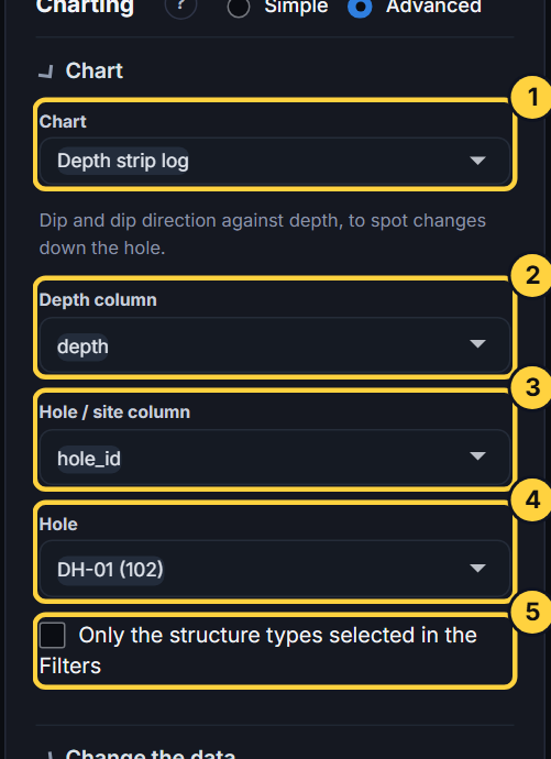
Why: a stereonet loses depth. The strip log shows where in the hole things happen: a fault zone with steeper fractures, a change of bedding dip with depth, a lithology that is more fractured.
Fracture frequency and RQD
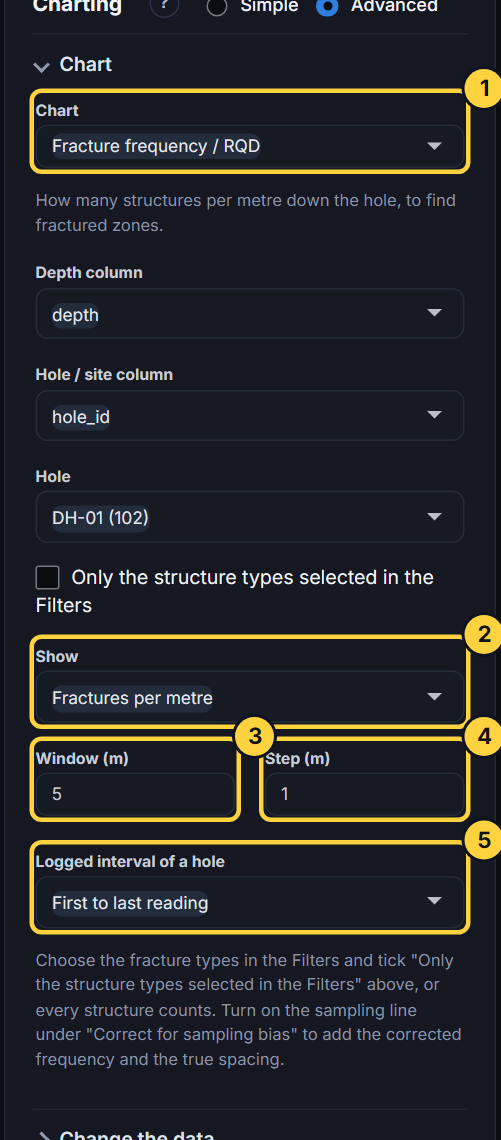
For one hole at a time, this chart shows Fractures per metre in a moving window, or RQD (percent, from the depths).
| Control | Meaning |
|---|---|
| Window (m) | The length counted at each point. Longer windows are smoother. Default 5 m. |
| Step (m) | How far the window moves each time. Default 1 m. |
| Logged interval of a hole | Which part of the hole counts: first to last reading, 0 m to the last reading, or a from-to you type. |
Choose the fracture types in the Filters and tick Only the structure types selected in the Filters, or every structure (bedding too) is counted.
The table under the chart covers every hole: readings, interval, fractures per metre, mean spacing, and two RQD estimates:
- RQD from depths: the percent of the interval in pieces 0.1 m or longer between fractures.
- RQD from frequency: 100·e^(−0.1λ)(0.1λ + 1), where λ is fractures per metre (Priest and Hudson, 1976).
With the sampling-bias correction on, the corrected frequency and the true spacing (the apparent spacing along the hole times |cos| of the angle between the hole and the mean pole) are added.
The attribute chart
Charts any column of the selected readings: Automatic chooses a histogram for numbers and bars for text; or choose Histogram, Cumulative percent, Bars or Pie. Histograms use Sturges’ rule for the number of bins. Text with more than 25 values shows the 24 commonest plus Other. The footer gives the count, blanks, and the minimum, median, mean and maximum.
Why: to check a column before relying on it. A histogram of depths shows gaps in logging; bars of structure types show how many readings each type really has.
The 3D views
3D hemisphere draws the poles on a bowl you can drag to turn and scroll to zoom. View starts it Oblique, in Plan (from above) (which is the stereonet) or in Section (from south). Contours, the mean and cone, the girdle and your constructions are drawn on the bowl.
Why: it shows what the stereonet projection is doing: the stereonet is this bowl seen from above.
3D drillhole traces draws each hole from its collar along its survey, with the structures at their depths. Holes chooses which holes; Show the structures selected in the Filters adds the structures. It needs a collar with x, y and z and either a survey or the collar’s azimuth and dip; a file that already has x, y, z for each structure shows the structures alone.
Use the camera icon on a 3D plot to save a picture.
Export and report
| Chart | Downloads |
|---|---|
| Stereonet | PNG, PDF, SVG, and Poles / planes (CSV): each reading as both the plane and its pole. |
| Rose | PNG, SVG. |
| Strip log | CSV of the plotted readings. |
| Fracture frequency | Frequency table (CSV). |
| Any | Report (HTML) and Report (PDF). |
The report is a complete record: a summary, the data and every setting you used, the quality checks, any readings you excluded, the stereonet and rose, the statistics, the by-structure-type table, the sets, the fracture frequency, and the methods with references. Attach it to your assignment; it lets a reader check your work.
Chart settings (Advanced): this browser remembers your display options for next time. Save settings writes them to a file you can share, so a class can use identical settings; Load settings… reads one back; Reset all returns to the defaults.
Exercises
- Cluster or girdle? Load Synthetic: joint set (cluster), then Synthetic: folded beds (girdle). For each, note the pattern, K, and what Auto draws. Why would a mean be misleading for the folded beds?
- Is the maximum real? On the Lachlan bedding demo, turn on Kamb contours. What is the highest contour? Change Contour interval to 1 and Lowest filled contour to 0. What new detail appears, and is it significant?
- Unfold a fold. On the folded-beds demo, turn on Unfold a fold with the fitted axis. What happens to the poles, and to kappa (given in the note)? What does the scatter that remains tell you?
- Sampling bias. On the drillhole demo, choose the joints, then turn on Correct for sampling bias with a vertical scanline you type in (trend 0, plunge 90). How does the mean change, and what is the effective sample size?
- Wedge. Draw the intersection of two planes 60/120 and 50/230 under Add to the net. What are its plunge and trend?